
Cool Data Visualization
Tags: Technology Management
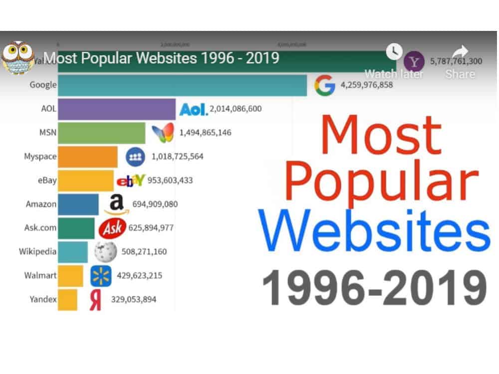
It is cool to see data visualizations. I especially enjoy the ones over a span of many years. Couple of good ones:
Most Popular Websites 1996 – 2019 based on number of visitors per month
Internet Users by Country 1990 – 2019 (Eye opener!)
Another cool one, World Population between 1960 to 2019


